As mentioned here, I’m learning about the art of data visualization and presentation, and am currently enrolled and engrossed in Alberto Cairo’s Introduction to Infographics and Data Visualization MOOC* and loving it.
Professor Cairo has shared a wealth of information graphics for my 4,999 classmates and me to study and critique as he enlightens us on principles of graphic design. New York Times Infographics is one great site to explore the variety of graphics designers use to convey information.
While I’m certain many of my classmates are experimenting with Adobe Illustrator, Tableau, and other software, I’m focusing on good old Microsoft Excel. Still a novice, I’m learning to choose appropriate charts and graphs for communicating stories that emerge from datasets, and modifying Excel’s default charts to enhance readers’ ability to make sense of the data. Here is a series of “before and after” charts I created for a current MOOC assignment.
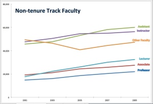
I was given a dataset about numbers of faculty members by rank. I chose to focus here on the changes in numbers of non-tenure track faculty by rank and create a line chart to show change over time for the different ranks.
Default Chart: The first chart is the default produced by Excel. As you can see, it makes no sense, so the first thing I did was to click “Switch Plot” to get the data on the correct axes (Note: I’m working on a Mac, so buttons and language may be slightly different on a PC). That got me to Changed Chart #1.
Changed Chart #1: Now the chart makes sense, with the correct data on the correct axes and legend. However, I noticed that having the total displayed obscured differences among individual ranks, and these differences were what I wanted to highlight.
Final Chart: I removed “total” data from the series to illuminate the differences I want to reader to notice. I then removed gridlines, removed the word “Fall” from the data series, and eliminated the legend, instead labeling the lines directly. Lastly, I added a title. Perfect? No. A good start for a learner? I think so!
Now, the reader can see that there was growth among non-tenure track higher ranking professors, even though their numbers remain lower that those of lower ranked professors. Now the reader can see the story, ask questions, and wonder about the implications of these data. I feel it isn’t important (for the particular story I want to tell) for the reader to see exact numbers for each rank for each year. Rather, I want to focus attention on the general changes that took place in this time span, and the relative numbers of each rank. A different story would require a different design.
Favorite Excel resources: My very favorite resource for learning Excel is Ann K. Emery’s Excel for Evaluation tutorials. These brief video lessons are so well-organized and well-presented. I’ve watched and learned from most of them. At 2-4 minutes each, they’re readily available on an as-needed basis. In fact, I just returned to a tutorial on “How to Transpose Data” and in under 2 minutes, was reminded how to change data in rows to columns.
Another resource worth another mention is David Shellard’s Data Visualization in Microsoft Excel, available free from the American Evaluation Association’s (AEA) public elibrary. Even better, if you’re a member, access the Coffee Break Webinar archives to hear Shellard himself describe the steps he used to modify charts.
Data visualization and information design is huge now and there is no dearth of websites, books, and blogs on the topic. What are your favorites?
*Massive Open Online Course (MOOC)


02/05/2013 at 9:44 am
Sheila, I love the “after” graph that you produced! I especially like how you removed the grid lines and tick marks to streamline the graph, and how you added text boxes with each faculty member’s title in place of the default legend.
Thanks for highlighting my tutorials! I made these for you last night: How to use the “switch row/column” icon (http://emeryevaluation.com/excel/graphs/#video44) and how to adjust the units shown in the axes (http://emeryevaluation.com/excel/graphs/#video45). It sounds like the “switch row/column” icon on my PC is called “Switch Plot” on your Mac?
Again, great graph! Thanks for sharing.
Ann
02/05/2013 at 11:59 am
Thank you so much for your comments Ann, and for creating these new tutorials. Both are great! Yes, “switch plot” is the language used on the Mac version of Excel and performs the same function as “switch row/column.”
Pingback: On Being Part of the 90% {sigh} | Evaluspheric Perceptions
Pingback: Is education (finally) joining the dataviz movement? | Evaluspheric Perceptions
Pingback: Data Visualization & Information Design: One Learner’s Perspective | Evaluspheric Perceptions